 Human Factors is, according to Wikipedia, the application of psychological and physiological principles to the engineering and design of products, processes, and systems. It is in a general sense an understanding the interactions between humans and things of interest. Often Human Factors is associated with ergonomics, such as sitting at a desk using a computer or factory workers assembling a product. It became a discipline of its own when psychologists and engineers during WWII looked at how pilots were using the controls of aircraft. It later found increased importance when scientists began studying how operators of nuclear power plants were having challenges keeping an eye on all the complex displays and inputs from the nuclear reactors.
Human Computer Interactions (HCI)
Human Factors organizations were formed first in the United Kingdom, then in the United States and later in Canada. Technical writers (or authors as the term is used in the UK) were part of these organizations. The role of Human Computer Interactions (HCI) became a focus with the beginning of the Information Age. Over time basic Human Factors principles were developed specifically for HCI.
The principles of HCI focus on a few basic concepts. The user should be familiar with the terms and phrases used in the product. The user should always be in control, not the system. Everything should be consistent in the system - don’t change the meaning or function of a task in another part of the product. Errors should be clearly described in error messages. Users shouldn’t have to remember information from one dialog to the next. Tasks should be as efficient as possible. User’s shouldn’t have to deal with noise, just the information. Finally, provide help to users.
Human factors principles
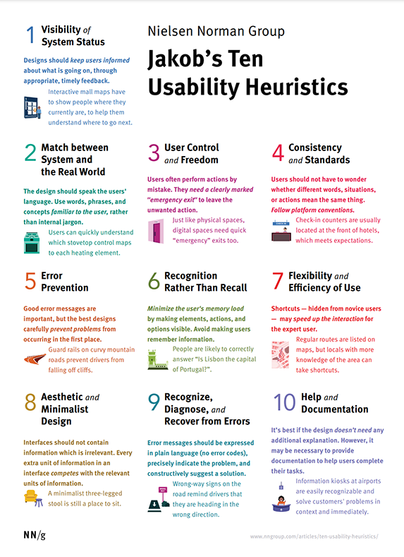
These principles are based on Jacob Nielson’s 10 Usability Heuristics for User Interface Design. The examples use traffic intersections to demonstrate the principles.
-
Visibility of system status - the system should always keep the users informed about what is going on through appropriate feedback. For example, the placement of the traffic lights across the intersection allow the user to be kept informed of the status of the intersection at all times.
-
Match between system and the real world - The system should speak with words, phrases and concepts familiar to the user, not system-oriented terms and phrases. For example, a traffic light that uses green to stop, blue to go would be a mismatch to what people expect these colours suggest.
-
User control and freedom - Provide a clearly marked “emergency exit” to cancel or undo a task. A stop line far enough back from the pedestrian crossing and the traffic light across the intersection allows a user to have sufficient time to be aware of traffic and pedestrian conditions and stop, or cancel, proceeding if a pedestrian is crossing in front of the car or if the intersection is not clear.
-
Consistency and standards - Words, situations or actions should always mean the same thing. Follow conventions. Imagine if every intersection had different rules. It would be maddening for drivers. In fact, this is often the case that intersections are designed inconsistently and drivers must learn quickly a new set of rules upon approaching the stop line. If they don’t quickly catch on, other drivers who do know are happy to inform them of their “supposed stupidity” with a blaring horn or worse.
-
Error prevention - a careful design is better than good error messages. Prevent a problem from occurring in the first place. Consider again our example. Simply moving the traffic light across the intersection solves a number of problems in advance. I often hear error messages at intersections here in Berlin. Drivers of the cars stopped at the stop line are doing what they should do – keeping aware of the status of the intersection. But as they cannot also keep an eye on the traffic light, they do not proceed when the light turns green. Hence, the drivers in cars behind offer their own error messages in the form of a blaring horn and often an additional hand signal to reinforce the error message.
-
Recognition rather than recall - Make objects, actions and options visible. User should not have to remember information from one part of the dialogue to another. Users should not have to remember the status of the intersection when their attention is off it to learn the status of the traffic light. They should be able to see the status of the intersection at the same time as seeing the status of the traffic light.
-
Flexibility and efficiency of use - Accelerators, unseen by the novice, speed up interaction for expert users. (All levels of users.) If you know that the traffic lights on a street are synchronized to a certain driving speed, an expert driver will maintain that speed to enjoy a constant stream of green lights. A novice will charge from traffic light to traffic light and get red lights almost every time.
-
Aesthetic and minimalist design - Dialogues contain no irrelevant information. No extra “noise.” Imagine a traffic light with advertisements on it. What relevance does an advertisement for a soft drink have to do with a traffic light? It might be a cool thing to add a pixel board above every traffic light to let a driver enjoy a clever advertising campaign. After all, the driver is just sitting there staring at the light. Why not add a small tasteful bit of information, such as the location of the nearest gas station or fast food outlet. It is noise and would distract from the main task at hand, which is keeping aware of traffic conditions and knowing when it is safe to proceed.
-
Help for users in recognizing, diagnosing and recovering from errors - Error messages should be expressed in plain language (not codes), indicate the problem and suggest a solution. In multi-lingual Europe, having all signs in English wouldn’t make much sense. Symbols that are universally recognized are, therefore, often used. The three colours of a traffic light are recognized universally and so satisfy plain language requirements. But often traffic signs are not so recognizable and a small phrase or word should accompany the sign so users can learn the “code’ of the sign. An arrow leading off a highway is often accompanied by an Exit sign to distinguish it from a sign indicating the upcoming direction of the highway.
-
Help and documentation - Any information should be easy to search, focused on the user’s task, list concrete steps to be carried out, and not be too large. Well, in the case of driving, size really does matter. That is, the size of the sign should make it visible from a distance (such as over a lane so cars way back in the line can clearly see the traffic light). You should not have to search for the traffic light. It should carry concise information that is focused on the task at hand. For instance, a traffic light should not also include pedestrian signals.
Good resources on Human Factors are readily available through a Google search. My favourite is the Human-Computer Interaction Resource Network.