Non-continuous status Dead Zones (Human Factors engineering example)
Traffic intersections. We have all used them. We’ve all had moments of anxiety crossing them. We’ve all had moments of sheer horror as we make a right or left turn and seeing a car barreling down on us. Will that driver stop? Can I make it safely across? These are all safety issues and I haven’t even started on the safety of pedestrians trying to cross the intersection.</p>
Dead zones - systemic design problems
If there is one place where the importance of the design of everyday things is paramount is the traffic intersection. Designed right they are entirely safe. Designed wrong and they become Dead Zones.
I never took much thought in the design of intersections until moving to Berlin, Germany. It’s hard to not be biased when encountering something new yet I have seen so many accidents happen at intersections in Canada and the US I have always assumed the problem lay with the drivers. And in most cases, it probably is but it is equally possible that it could be the fault of the intersection design.
At great risk of annoying my fellow Berlin residents, I cautiously tiptoe into German road design. Nothing is more sacred to Germans than das Auto and die Strasse. So, at great risk, I venture this opinion piece.
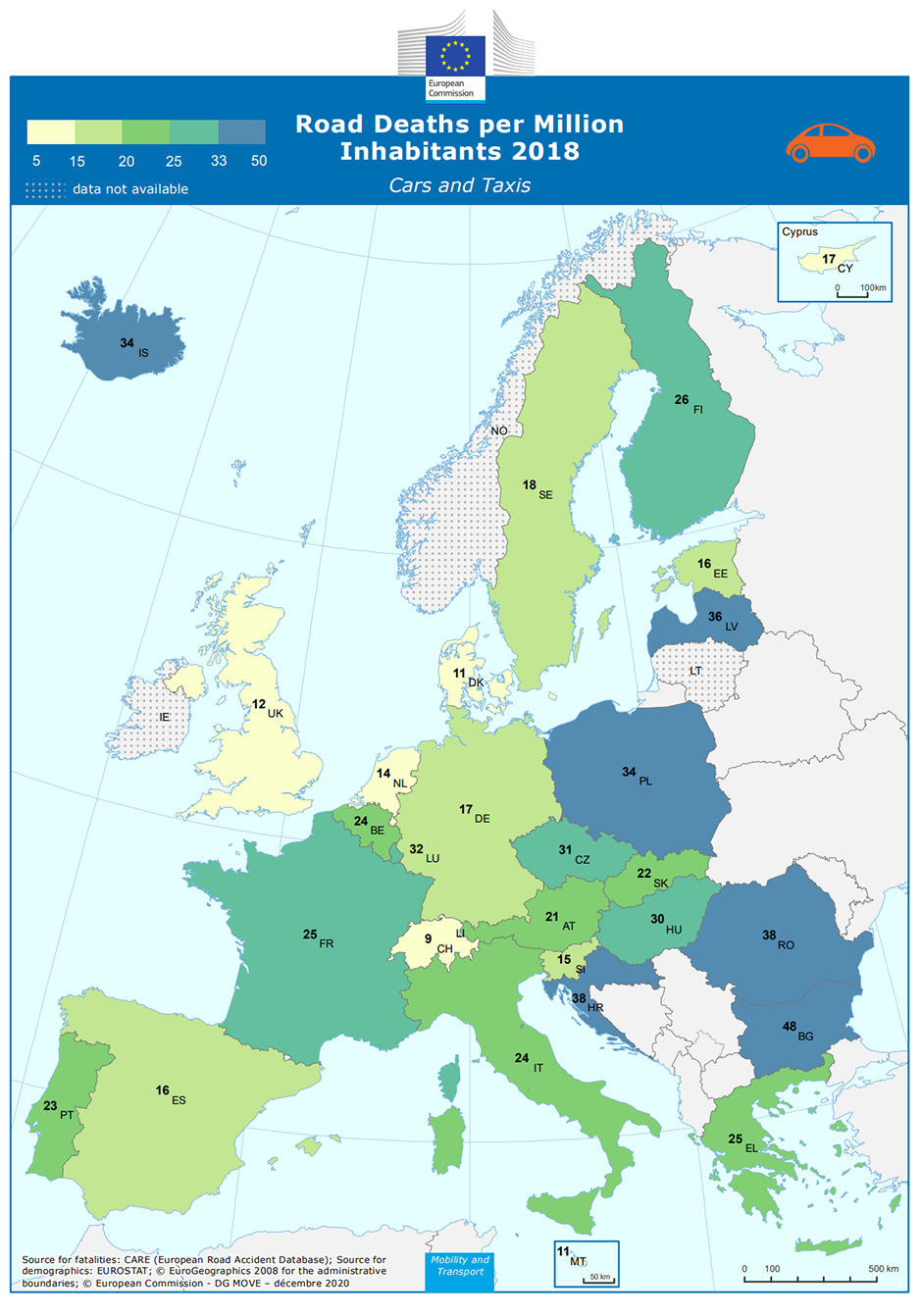
At the outset I should say that Germany has one of the lowest traffic accident rates in Europe, far behind the champion Romania at 85 deaths per million and Latvia who pulls up a strong second place at 74 deaths per million. In contrast Germany rates a paltry 33 deaths per million residents. Now this might just be due to heavy public transit use. If people are not in cars then it seems being in an accident is not very likely to happen. Still, Sweden has a very safe driving record at 18 deaths per million and as a country they are primarily drivers and not transit users.

traffic accidents Europe in 2016.
Many factors go into death rates including intoxication, driver inattention, speed and more but I want to focus on the traffic intersection
Continuous status information
A basic principle of good design and usability is to provide to the user Continuous Status Information. This way a user knows at any point where they are in a task, where they have been and where they need to go to complete the task.
However, for a driver which is a user of public roads enters a traffic intersection to make a left turn, right turn or to proceed straight, he or she needs to know at all times the current status information of the intersection. However, with the placement of the traffic signals in intersections in Germany, at some point when the driver enters the intersection, they no longer know the state of the traffic signals. Is the light still green? Has it turned yellow? Is it now red? From a certain point in the intersection it is impossible to know the state of the traffic signals
How can this be? Certainly a user always knows. But do they. Perhaps having lived with this type of intersection all their lives, they assume they know but the facts tell otherwise.
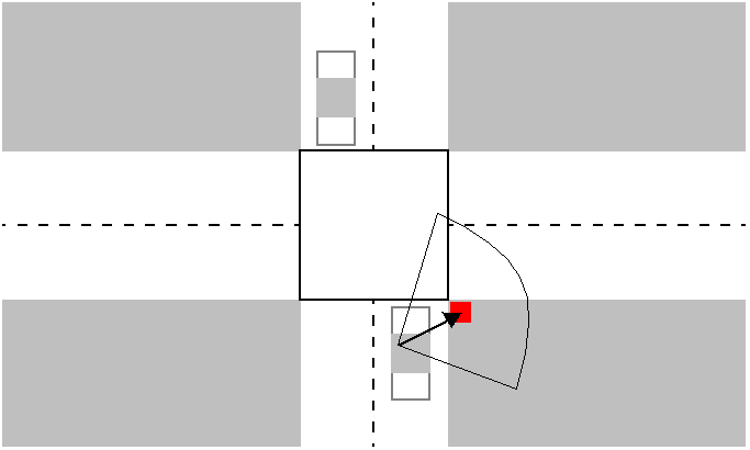
Once the car or truck enters the intersection, the driver no longer can see the traffic signals because they are now behind the car. No traffic signals are placed on the opposite sides. In a German intersection these lights are placed on the corners of the entrance of the intersection.
Consider this illustration. Notice where the traffic signal is and what the driver must do to pay attention to the light? Is the driver aware of other events in the intersection such as an oncoming car? Possibly, but the driver’s main interest is the traffic signal and when he or she can proceed.

Traffic in intersections.
Some will say, well a little arrow is added on the far left corner to inform the user that the light has turned red and they can now complete the turn if they happen to be in the intersection. This seems a bit like an afterthought not a fully planned out intersection.
It is like a workaround in software when a problem is noticed but rather than completely redesigning the software a bit of code is written to deal with the problem for the short term. But this short term problem becomes a permanent solution.
It is not a complete rethink. It isn’t a complete redesign. If the driver is in the intersection, as long as this ad hoc light is not illuminated, the light is still red. Before this arrow appears, the user is in a ‘Dead Zone”. This dead zone is a void of any user information - except some other driver behind honking the horn to indicate, yes, you can go.
Dead Zone Free
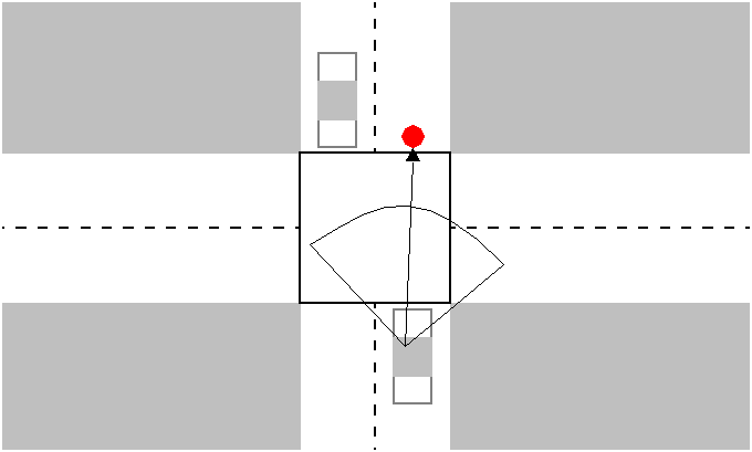
How would this problem be solved? Place the traffic lights on the OPPOSITE side of the intersection so drivers within the intersection always have current status information. It is a complete rethink of the traffic intersection with the traffic signals placed to PREVENT a dead zone.

Traffic in intersections
In some configurations the traffic lights are placed on both the near and far sides of the intersection and a third light is added for vehicles making a turn. No matter where the vehicle is in the intersection, status information is always provided. Whether the driver is turning left, right, or straight ahead, the status of the traffic signal can always be seen.
Product “Dead Zones”
The German traffic intersection is an example of the design of things in everyday life that shows the importance of providing status information at all times during a procedure.
At any point, the user needs knows where he or she is in the procedure, knows what decision to make based on the information provided and never enters a “dead zone”.
Software users can enter dead zones as well. This is a state when the product offers no user information to the user. What should the user do next? What is the product doing? Does the user need to wait for the “arrow” to appear to let them know what to do next? What is the software currently doing?
As a technical writer, I see this all the time when I document software. Sometimes, the only status information the product can provide IS the documentation.
Good status information should include the following:
- What is the goal of the procedure? What is the purpose of the procedure and where it fits in the context of a larger procedure
- At what stage is the user in a procedure?
- What has been done so far in the procedure? At what point they are in the procedure?
- What is the next step in the procedure to complete the task?
If none of that is available, then it is called a Dead Zone. For me in Berlin, when I am in a Dead Zone in a traffic intersection, usually the only signal I get is from a loud honk from the driver behind me to move. Seems to me that is poor planning. They are the only ones who have the status information. Not me. I am in a Dead Zone.